Colour theory was originally formulated in terms of three "primary" or "primitive" colours—red, yellow and blue (RYB)—because these colours were believed capable of mixing all other colours. This colour mixing behavior had long been known to printers, dyers and painters, but these trades preferred pure pigments to primary colour mixtures, because the mixtures were too dull (unsaturated).

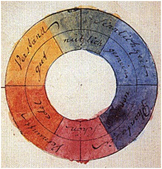
Goethe's colour wheel from his 1810 Theory of Colours
The RYB primary colours became the foundation of 18th century theories of colour vision, as the fundamental sensory qualities that are blended in the perception of all physical colours and equally in the physical mixture of pigments or dyes. These theories were enhanced by 18th-century investigations of a variety of purely psychological colour effects, in particular the contrast between "complementary" or opposing hues that are produced by colour afterimages and in the contrasting shadows in coloured light. These ideas and many personal colour observations were summarized in two founding documents in colour theory: the Theory of Colours (1810) by the German poet and government minister Johann Wolfgang von Goethe, and The Law of Simultaneous Colour Contrast (1839) by the French industrial chemist Michel Eugène Chevreul.
Subsequently, German and English scientists established in the late 19th century that colour perception is best described in terms of a different set of primary colours—red, green and blue violet (RGB)—modelled through the additive mixture of three monochromatic lights. Subsequent research anchored these primary colours in the differing responses to light by three types of colour receptors or cones in the retina (trichromacy). On this basis the quantitative description of colour mixture or colorimetric developed in the early 20th century, along with a series of increasingly sophisticated models of colour space and colour perception, such as the opponent process theory.
Across the same period, industrial chemistry radically expanded the colour range of lightfast synthetic pigments, allowing for substantially improved saturation in colour mixtures of dyes, paints and inks. It also created the dyes and chemical processes necessary for colour photography. As a result three-colour printing became aesthetically and economically feasible in mass printed media, and the artists' colour theory was adapted to primary colours most effective in inks or photographic dyes: cyan, magenta, and yellow (CMY). (In printing, dark colours are supplemented by a black ink, known as the CMYK system; in both printing and photography, white is provided by the colour of the paper.) These CMY primary colours were reconciled with the RGB primaries, and subtractive colour mixing with additive colour mixing, by defining the CMY primaries as substances that absorbed only one of the retinal primary colours: cyan absorbs only red (−R+G+B), magenta only green (+R−G+B), and yellow only blue violet (+R+G−B). It is important to add that the CMYK, or process, colour printing is meant as an economical way of producing a wide range of colours for printing, but is deficient in reproducing certain colours, notably orange and slightly deficient in reproducing purples. A wider range of colour can be obtained with the addition of other colours to the printing process, such as in Pantone's Hexachrome printing ink system (six colours), among others.

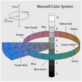
Munsell's colour system represented as a three-dimensional solid showing all three colour making attributes: lightness, saturation and hue.
For much of the 19th century artistic colour theory either lagged behind scientific understanding or was augmented by science books written for the lay public, in particular Modern Chromatics (1879) by the American physicist Ogden Rood, and early colour atlases developed by Albert Munsell (Munsell Book of Colour, 1915, see Munsell colour system) and Wilhelm Ostwald (Colour Atlas, 1919). Major advances were made in the early 20th century by artists teaching or associated with the German Bauhaus, in particular Wassily Kandinsky, Johannes Itten, Faber Birren and Josef Albers, whose writings mix speculation with an empirical or demonstration-based study of colour design principles.
Contemporary colour theory must address the expanded range of media created by digital media and print management systems, which substantially expand the range of imaging systems and viewing contexts in which colour can be used. These applications are areas of intensive research, much of it proprietary; artistic colour theory has little to say about these complex new opportunities.


